
What Is Tailwind CSS? Why Developers Love It
What Is Tailwind CSS? Why Developers Love It
If you have spent any time in the frontend development world over the past few years, you have almost certainly encountered Tailwind CSS. It is one of the most talked-about CSS frameworks in modern web development, and for good reason. But what exactly is Tailwind CSS, how does it work, and why do so many developers swear by it?
In this comprehensive guide, we will break down everything you need to know about Tailwind CSS: what it is, how it differs from traditional CSS frameworks, why developers love it, its pros and cons, and how it compares to alternatives like Bootstrap, Bulma, and Material UI. Whether you are a seasoned developer or someone just starting to explore frontend styling, this article will give you the full picture.
What Is Tailwind CSS?
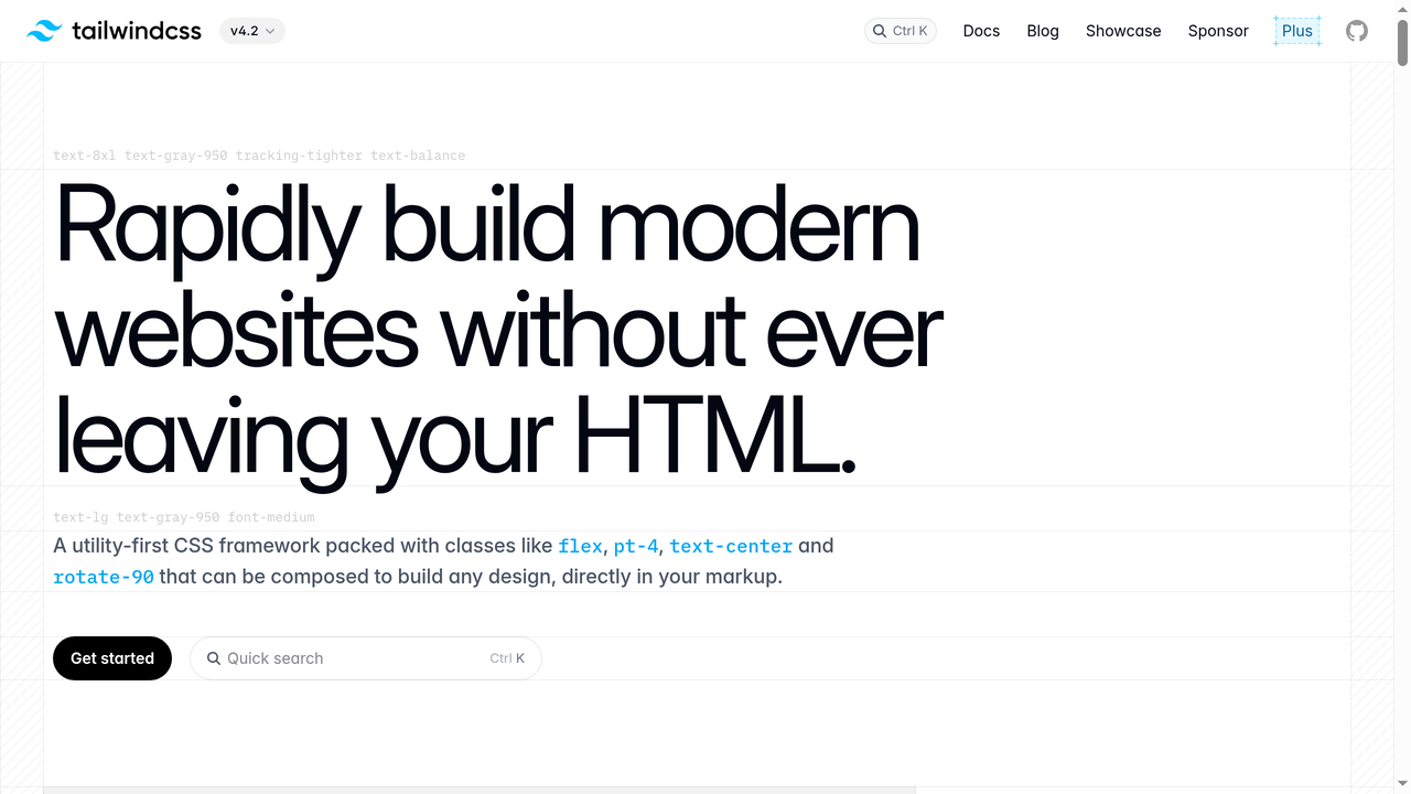
Tailwind CSS is a utility-first CSS framework that provides a massive collection of low-level utility classes you can use to build custom designs directly in your HTML. Instead of giving you pre-designed components like buttons, cards, or navbars (the way Bootstrap does), Tailwind gives you building blocks like flex, pt-4, text-center, and bg-blue-500 that you compose to create any design you want.
Created by Adam Wathan and first released in 2017, Tailwind CSS has grown from a niche experiment into one of the most popular CSS frameworks in the world. As of 2026, it has over 85,000 stars on GitHub and is used by companies like Shopify, Netflix, NASA, and countless startups.
The core philosophy behind Tailwind is simple: instead of writing custom CSS in separate stylesheets, you apply small, single-purpose utility classes directly to your HTML elements. This approach might look unusual at first, but it fundamentally changes how you think about styling web applications.
A Quick Example
Here is what a simple card component looks like with Tailwind CSS:
<div class="max-w-sm rounded-lg overflow-hidden shadow-lg bg-white">
  <img class="w-full" src="/img/card-image.jpg" alt="Card image">
  <div class="px-6 py-4">
    <h3 class="font-bold text-xl mb-2">Card Title</h3>
    <p class="text-gray-700 text-base">
      Some description text goes here.
    </p>
  </div>
</div>
Every class does exactly one thing: max-w-sm sets a max width, rounded-lg adds rounded corners, shadow-lg applies a box shadow, px-6 adds horizontal padding, and so on. You never have to leave your HTML to understand or modify the styling.
How Does Tailwind CSS Work?
Under the hood, Tailwind CSS works differently from traditional CSS frameworks. Here is the simplified process:
- You install Tailwind as a dependency in your project (via npm, yarn, or the Tailwind CLI).
- You configure it using a
tailwind.config.jsfile where you can customize colors, spacing, fonts, breakpoints, and more. - You write your HTML using Tailwind's utility classes.
- Tailwind scans your files and generates only the CSS for the classes you actually used. This means your production CSS bundle is tiny, often under 10KB gzipped.
This is a crucial point. Unlike older frameworks that ship a massive CSS file (Bootstrap 5's full CSS is over 200KB unminified), Tailwind's JIT (Just-In-Time) compiler only generates the styles you use. The result is a much smaller file size and faster page loads.
The JIT Compiler
Tailwind's JIT engine, which became the default in version 3.0, was a game-changer. Before JIT, Tailwind generated every possible utility class during development, resulting in huge CSS files during dev builds. The JIT compiler flipped this approach: it watches your template files and generates utility classes on demand, in real time.
This means:
- Development builds are just as fast as production builds
- You can use arbitrary values like
top-[117px]orbg-[#1da1f2]without any configuration - Every variant (hover, focus, responsive) is available by default with zero cost
- Your CSS file is always tiny, regardless of how large your project is
Tailwind CSS v4: The Latest Evolution
In early 2025, Tailwind CSS v4 was released, representing the biggest architectural change since the framework's creation. Key improvements include:
- New high-performance engine written in Rust, delivering up to 10x faster builds
- CSS-first configuration - instead of JavaScript config files, you configure Tailwind directly in CSS using
@themedirectives - Automatic content detection - no need to configure content paths manually
- Built-in import support - no need for additional PostCSS plugins for
@import - Zero-configuration for most projects - just add
@import "tailwindcss"to your CSS - Native cascade layers for better specificity management
These changes made Tailwind even more approachable and performant, solidifying its position as the go-to utility CSS framework.
Why Developers Love Tailwind CSS
Tailwind CSS has a passionate community, and the reasons developers love it go beyond simple preference. Here are the main ones:
1. Speed of Development
Once you learn Tailwind's naming conventions, you can style components incredibly fast. There is no context-switching between HTML and CSS files, no inventing class names, and no hunting through stylesheets to find the right selector. Everything is right there in your markup.
Many developers report that they build UIs 2-3x faster with Tailwind compared to writing custom CSS. The muscle memory you develop with the utility classes means you can translate designs into code almost as fast as you can think.
2. No More Naming Things
One of the most underrated benefits of Tailwind is that you never have to come up with class names. If you have ever spent 5 minutes debating whether to call something .card-wrapper, .card-container, or .card-outer, you know the pain. With Tailwind, the naming problem simply disappears.
This might sound trivial, but naming is genuinely one of the hardest problems in programming. Tailwind removes it from the CSS equation entirely.
3. Consistency by Default
Tailwind ships with a carefully designed design system out of the box. The spacing scale (0, 1, 2, 3, 4, 5, 6, 8, 10, 12...), the color palette, the font sizes - they are all designed to work harmoniously together.
This means even if you are not a designer, your spacing and sizing will look consistent and professional. You are picking from a constrained set of values rather than typing arbitrary pixel counts. It is like having a design system for free.
4. Responsive Design Made Simple
Tailwind's responsive utilities are brilliant. Instead of writing media queries in CSS, you prefix any utility with a breakpoint:
<div class="text-sm md:text-base lg:text-lg xl:text-xl">
  Responsive text
</div>
This says: small text by default, medium on tablet, large on desktop, extra large on big screens. It is intuitive, readable, and far less error-prone than managing media queries in separate stylesheets.
5. State Variants Are Effortless
Hover states, focus states, active states, dark mode - all handled with simple prefixes:
<button class="bg-blue-500 hover:bg-blue-700 focus:ring-2 focus:ring-blue-300 dark:bg-blue-800">
  Click me
</button>
No separate CSS rules, no pseudo-selector blocks. Everything is co-located with the element it affects.
6. Tiny Production Bundles
Because Tailwind only generates the CSS you use, production bundles are remarkably small. A typical Tailwind project might produce 8-15KB of CSS (gzipped), compared to the 25-50KB you would get with Bootstrap or other component frameworks. For performance-conscious developers, this is a significant win.
7. Perfect for Component-Based Frameworks
Tailwind shines in modern component-based architectures like React, Vue, Svelte, and Angular. Since each component contains its own markup and styling (via utility classes), there are no global CSS conflicts, no specificity wars, and no dead CSS. When you delete a component, its styles go with it.
8. Extensive Customization
While Tailwind comes with sensible defaults, everything is customizable. You can define your own colors, spacing scale, fonts, breakpoints, and even create custom utilities. The configuration system is powerful but straightforward.
9. Dark Mode Support
Tailwind makes dark mode trivially easy. You just prefix classes with dark::
<div class="bg-white dark:bg-gray-900 text-gray-900 dark:text-white">
  This adapts to dark mode automatically.
</div>
You can toggle dark mode based on the user's system preferences or a manual toggle. No additional CSS files, no complex theming setup.
10. The Community and Ecosystem
Tailwind has an incredible ecosystem. Tailwind UI offers premium, professionally designed component templates. Headless UI provides unstyled, accessible UI components that pair perfectly with Tailwind. Thousands of free component libraries, templates, and plugins exist in the community. The documentation is widely considered some of the best in the industry.
Common Criticisms of Tailwind CSS (And Honest Answers)
Tailwind is not without its critics. Let us address the most common objections honestly:
"The HTML Looks Ugly and Bloated"
This is the number one complaint. A Tailwind component can end up with a long string of classes:
<button class="inline-flex items-center px-4 py-2 border border-transparent text-sm font-medium rounded-md shadow-sm text-white bg-indigo-600 hover:bg-indigo-700 focus:outline-none focus:ring-2 focus:ring-offset-2 focus:ring-indigo-500">It is a fair criticism. The markup is verbose. However, in practice, this matters less than you think:
- In component-based frameworks, you write this once in a
Button.jsxcomponent and reuse it everywhere - Tools like Prettier's Tailwind plugin automatically sort and format your classes
- The verbosity in HTML is offset by having zero CSS files to maintain
- You always know exactly what an element looks like by reading its classes
"It Is Just Inline Styles"
This is a misconception. Tailwind utilities are far more powerful than inline styles:
- They support responsive breakpoints (inline styles cannot)
- They support hover/focus/active states (inline styles cannot)
- They enforce a design system with constrained values
- They support dark mode
- They are reusable and composable
"It Violates Separation of Concerns"
The traditional argument is that HTML should handle structure and CSS should handle presentation. Tailwind challenges this by co-locating styles with markup.
But here is the counterargument: in modern component-based development, a "concern" is a component, not a technology layer. A Button component's structure, styling, and behavior all belong together. Tailwind aligns with this modern understanding of separation of concerns.
"It Is Hard to Learn"
There is a learning curve, but it is shorter than most people expect. If you already know CSS, learning Tailwind is mostly about memorizing the class names - and most of them are intuitive (flex, grid, text-center, font-bold). Most developers report being productive within a few days.
Tailwind CSS vs. Bootstrap: The Big Comparison
The most common comparison is Tailwind vs. Bootstrap, since both are immensely popular CSS frameworks. Here is how they differ:
| Feature | Tailwind CSS | Bootstrap |
|---|---|---|
| Approach | Utility-first (building blocks) | Component-first (pre-built UI) |
| Customization | Highly customizable from ground up | Customizable via Sass variables |
| Bundle size (production) | ~8-15KB gzipped | ~25-50KB gzipped |
| Learning curve | Moderate (need CSS knowledge) | Low (copy-paste components) |
| Design uniqueness | Every site looks different | Sites often look similar |
| JavaScript included | No (CSS only) | Yes (JS for interactive components) |
| Best for | Custom designs, component frameworks | Rapid prototyping, admin panels |
| Community size | Massive and growing fast | Massive and established |
Neither framework is objectively "better." Bootstrap is great for quickly building standard-looking interfaces. Tailwind is better when you want full control over your design without fighting framework defaults.
Tailwind CSS Alternatives Worth Knowing
While Tailwind dominates the utility-first space, there are several CSS frameworks and approaches worth considering depending on your project needs.
Bootstrap
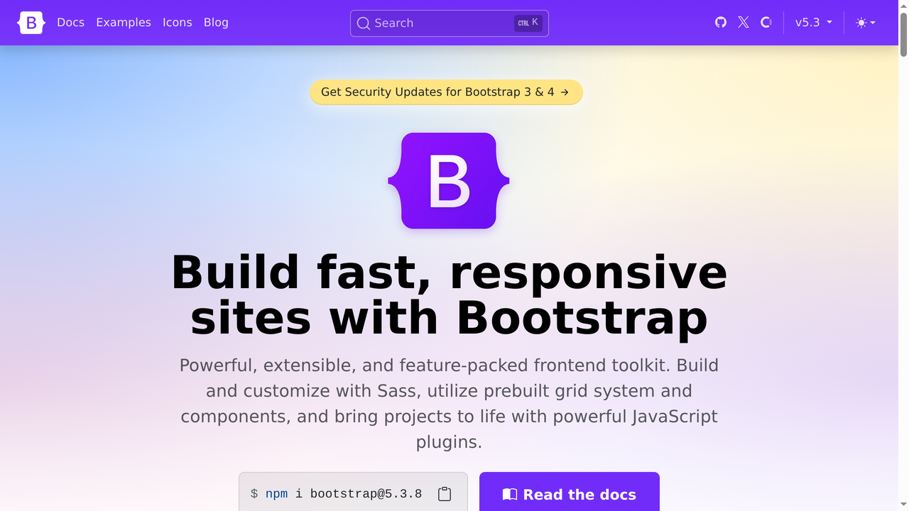
Bootstrap remains the most widely used CSS framework in the world. Originally created by Twitter engineers in 2011, it has been the go-to choice for developers who want pre-built, styled components right out of the box.
Bootstrap takes the opposite approach from Tailwind: instead of utility classes, it gives you complete components like .btn, .card, .navbar, and .modal that come with predefined styles. You can customize them via Sass variables, but the starting point is always Bootstrap's opinionated design.
Best for: Rapid prototyping, admin dashboards, internal tools, and projects where design originality is less important than speed. If you need a working UI in hours rather than days and do not mind the "Bootstrap look," it is still an excellent choice.
Downsides: Sites built with Bootstrap tend to look similar unless you invest significant effort in customization. The full framework is heavier than a Tailwind production build. Overriding Bootstrap's styles can lead to specificity battles.
Bulma
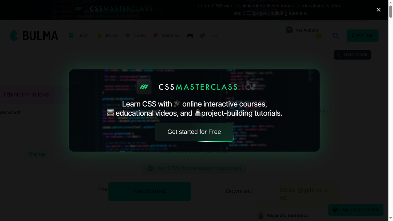
Bulma is a modern, open-source CSS framework built entirely on Flexbox. It sits somewhere between Bootstrap and Tailwind in philosophy: it provides pre-built components, but with a cleaner, more modern aesthetic and no JavaScript dependencies.
Bulma is pure CSS, meaning it does not ship any JavaScript. This makes it lightweight and framework-agnostic. Its class naming is readable and intuitive - .is-primary, .is-large, .columns, .is-flex - making it easy to pick up for beginners.
Best for: Developers who want a component-based framework without the JavaScript overhead. It is a good middle ground if you find Bootstrap too heavy and Tailwind too low-level. The Flexbox-native grid system is excellent.
Downsides: Smaller community and ecosystem than Bootstrap or Tailwind. Development pace has slowed in recent years. Limited utility class support compared to Tailwind.
Foundation

Foundation by Zurb was one of the first major responsive CSS frameworks. It has been used by companies like Disney, Amazon, and National Geographic. Foundation offers two products: Foundation for Sites and Foundation for Emails.
Foundation is known for its advanced responsive grid system and accessibility features. It was ahead of its time in many ways, offering a responsive grid, off-canvas navigation, and motion UI before these became standard features.
Best for: Enterprise projects that need robust accessibility support and email template development. Foundation for Emails is one of the best solutions for building responsive HTML emails, a notoriously difficult task.
Downsides: The framework has largely fallen out of favor for general web development. Its community has shrunk significantly compared to Bootstrap and Tailwind. Updates are infrequent. For new projects, Tailwind or Bootstrap are generally better choices.
Material UI (MUI)
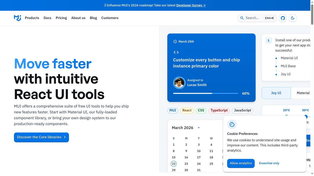
Material UI (MUI) is a React component library that implements Google's Material Design. It is the most popular React UI library, with over 95,000 GitHub stars and widespread adoption in the React ecosystem.
MUI is not really a CSS framework in the same sense as Tailwind - it is a full component library with pre-built, accessible React components. Each component comes with Material Design styling, built-in animations, and comprehensive theming support.
Best for: React applications that want a polished, Material Design-based look with minimal effort. The component library is comprehensive, covering everything from buttons and forms to complex data tables, date pickers, and tree views.
Downsides: React-only. Sites built with MUI can look very "Google." The bundle size is significant if you use many components. Customizing beyond Material Design's aesthetics can be frustrating. Some developers find the theming API complex.
Chakra UI
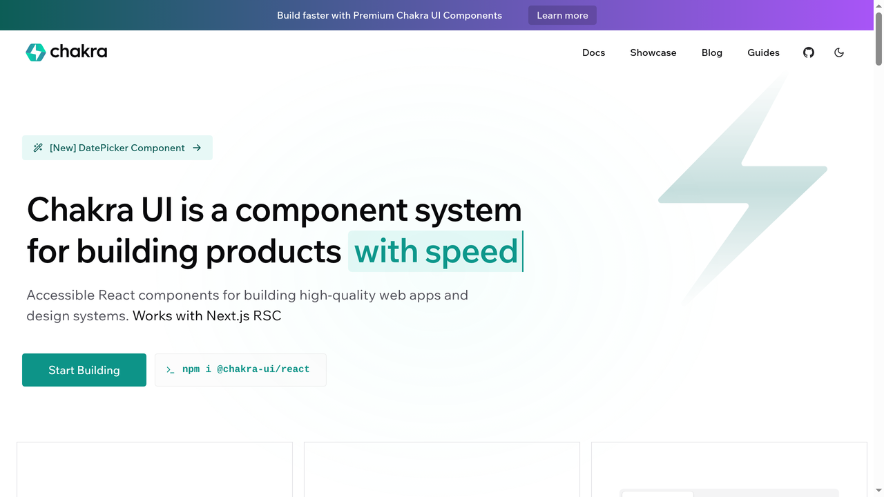
Chakra UI is a React component library that uniquely blends component-based and utility-based approaches. It gives you pre-built, accessible components, but you style them using utility props directly on the components.
For example: <Box p={4} bg="blue.500" borderRadius="lg">. This approach feels like a middle ground between Tailwind and traditional component libraries. You get the speed of utility styling with the convenience of pre-built components.
Best for: React developers who like Tailwind's utility approach but also want pre-built, accessible components. Chakra's accessibility is excellent - every component is WAI-ARIA compliant out of the box. The developer experience is outstanding.
Downsides: React-only (though there is a Vue port). Smaller ecosystem than MUI. Performance can be a concern for very large applications due to runtime style generation. The project has undergone significant changes with Chakra v3.
Styled Components
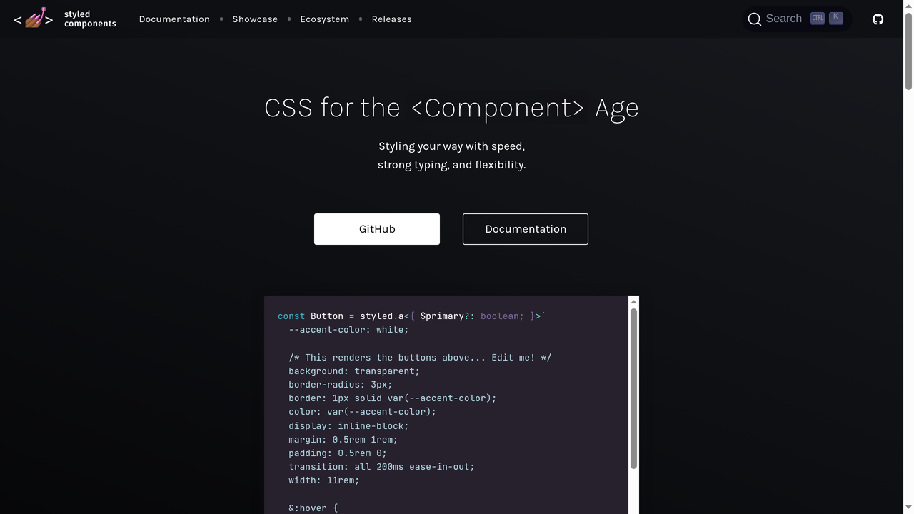
Styled Components is a CSS-in-JS library for React (and React Native) that lets you write actual CSS inside your JavaScript files using tagged template literals. It represents a fundamentally different approach to styling: instead of utility classes or external stylesheets, your styles live inside your component files as JavaScript.
Example: const Button = styled.button`background: blue; color: white; padding: 8px 16px;`
Best for: Developers who prefer writing real CSS but want it scoped to components. It is excellent for design systems and theme-based applications. Dynamic styling based on props is where Styled Components really excels.
Downsides: Runtime CSS generation adds overhead. Server-side rendering setup can be complex. The CSS-in-JS approach has been losing favor to zero-runtime solutions like Tailwind. Debugging can be harder since styles are in JavaScript. The project's development pace has slowed.
How Tailwind CSS Fits Into the AI Era
One of the most interesting developments for Tailwind CSS is how well it works with AI-powered development tools. Because Tailwind classes are self-documenting and follow consistent patterns, AI coding assistants and app builders can generate Tailwind markup with remarkable accuracy.
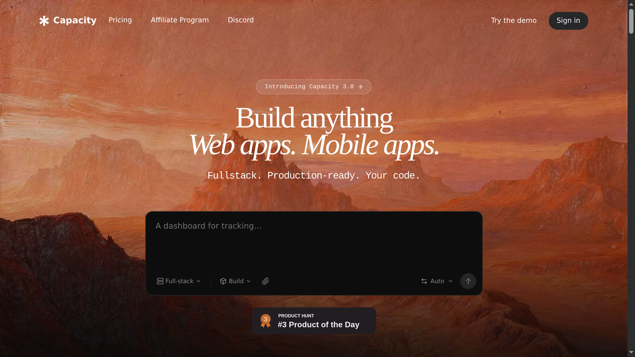
Platforms like Capacity.so have leaned heavily into Tailwind CSS for their AI-generated applications. When you describe a web app to Capacity's AI, it generates production-ready code using React and Tailwind CSS - complete with responsive design, dark mode support, and properly structured components.
This is not a coincidence. Tailwind's utility-first approach maps perfectly to how AI models think about styling:
- Predictable patterns: AI models can learn Tailwind's naming conventions easily because they follow logical rules (e.g.,
p-4for padding,m-2for margin,text-lgfor large text) - Self-contained: Each component's styling is fully visible in its markup, making it easier for AI to generate and modify
- No side effects: Changing a Tailwind class only affects the element it is on, so AI can modify styles without worrying about breaking other parts of the page
- Design system constraints: The limited set of values means AI-generated designs automatically look consistent
If you are building web applications with AI tools in 2026, understanding Tailwind CSS is practically essential. It is the default styling approach for most AI app builders, and knowing how to read and tweak Tailwind classes lets you refine AI-generated output quickly.
When Should You Use Tailwind CSS?
Tailwind is excellent for many scenarios, but it is not always the best choice. Here is a decision framework:
Use Tailwind When:
- You want complete design freedom without fighting framework defaults
- You are building with a component-based framework (React, Vue, Svelte, etc.)
- You care about performance and want minimal CSS bundle sizes
- Your team values consistency and wants a built-in design system
- You are working with AI tools that generate code (they almost always use Tailwind)
- You want rapid iteration without managing separate CSS files
- You are building a design system or component library
Consider Alternatives When:
- You need a quick prototype and pre-built components matter more than custom design (use Bootstrap)
- You are building a content-heavy site with minimal custom UI (vanilla CSS or a simple theme might suffice)
- Your team strongly prefers traditional CSS and the learning curve is a concern
- You need Material Design specifically (use MUI)
- You are building responsive HTML emails (use Foundation for Emails or MJML)
Getting Started with Tailwind CSS
Ready to try Tailwind? Here is how to get started in 2026:
Option 1: The CDN (Quick Testing)
For experimentation, you can add Tailwind via CDN:
<script src="https://cdn.tailwindcss.com"></script>This is great for prototyping but not recommended for production.
Option 2: Install via npm (Recommended)
npm install tailwindcss @tailwindcss/cliCreate a CSS file with:
@import "tailwindcss";Run the CLI to compile:
npx @tailwindcss/cli -i input.css -o output.css --watchThat is it. In Tailwind v4, there is no config file required for most projects.
Option 3: Framework Integration
Tailwind has first-class support for every major framework:
- Next.js / React: Built-in Tailwind support in
create-next-app - Vite: Official
@tailwindcss/viteplugin - Nuxt / Vue: Official
@nuxtjs/tailwindcssmodule - SvelteKit: Built-in support
- Laravel: Ships with Tailwind by default
Option 4: Let AI Handle It
If you do not want to set up tooling at all, platforms like Capacity.so let you describe your app in plain language and generate a full-stack application with Tailwind CSS already configured. You can then customize the generated Tailwind classes to match your exact vision. This is increasingly how new projects get started in 2026.
Essential Tailwind CSS Tips and Best Practices
Here are some tips that will make your Tailwind experience much smoother:
1. Use the Tailwind CSS IntelliSense Extension
If you use VS Code, the official Tailwind CSS IntelliSense extension is a must-have. It provides autocomplete for all utility classes, shows you the underlying CSS on hover, and highlights errors. It eliminates the need to constantly reference the documentation.
2. Learn the Spacing Scale
Tailwind's spacing scale is the foundation of consistent layouts. The values follow a pattern: 1 = 0.25rem (4px), 2 = 0.5rem (8px), 4 = 1rem (16px), 8 = 2rem (32px). Once you internalize this scale, you can size and space elements without thinking.
3. Embrace @apply Sparingly
Tailwind provides an @apply directive that lets you extract utility patterns into custom CSS classes. Use it sparingly - only for highly repeated patterns that cannot be solved with components. Over-using @apply defeats the purpose of utility-first CSS.
4. Use Component Extraction Instead of @apply
In most cases, creating a reusable component (React component, Vue component, partial template) is better than using @apply. Components encapsulate both markup and styling, while @apply only extracts the styling.
5. Sort Your Classes
Install the official Prettier plugin for Tailwind CSS (prettier-plugin-tailwindcss). It automatically sorts your utility classes in a consistent, logical order. This makes code reviews much easier and eliminates debates about class ordering.
6. Use Tailwind's Group and Peer Modifiers
Need to style a child element based on a parent's state? Use group:
<div class="group hover:bg-gray-100">
  <p class="group-hover:text-blue-600">I change color when the parent is hovered</p>
</div>
For sibling-based styling, use peer. These modifiers are incredibly powerful and eliminate the need for complex CSS selectors.
Frequently Asked Questions
Is Tailwind CSS free?
Yes. Tailwind CSS is completely free and open-source under the MIT license. The premium product, Tailwind UI, is paid, but the core framework costs nothing.
Is Tailwind CSS good for beginners?
It depends. If you already know CSS, Tailwind is easy to learn. If you are brand new to CSS, it is better to learn CSS fundamentals first, then adopt Tailwind. Tailwind does not teach you CSS - it provides a faster way to write it.
Can I use Tailwind CSS with WordPress?
Yes. You can use Tailwind in WordPress theme development. There are starter themes and build tools specifically designed for using Tailwind with WordPress.
Does Tailwind CSS work with React/Vue/Angular?
Yes, Tailwind works beautifully with all major JavaScript frameworks. In fact, component-based frameworks are where Tailwind shines brightest, since each component encapsulates its own utility classes.
Is Tailwind CSS better than Bootstrap?
Neither is universally better. Tailwind is better for custom designs and performance. Bootstrap is better for rapid prototyping with pre-built components. Your choice depends on your project's priorities.
Will Tailwind CSS slow down my website?
No. Tailwind CSS typically produces smaller CSS bundles than other frameworks because it only includes the styles you use. This actually makes your website faster, not slower.
What companies use Tailwind CSS?
Shopify, Netflix, NASA, Heroku, Loom, Coinbase, and thousands of other companies use Tailwind CSS in production. It is one of the most widely adopted CSS frameworks in the industry.
Can I use Tailwind CSS without a build step?
Yes. The Tailwind CDN script lets you use Tailwind without any build tools. However, for production websites, using the CLI or a framework plugin is recommended for optimal performance.
Conclusion
Tailwind CSS has fundamentally changed how developers approach styling on the web. By providing a comprehensive set of utility classes instead of pre-designed components, it gives developers the freedom to create truly unique designs while maintaining consistency and performance.
The reasons developers love it are practical: faster development, smaller bundles, no naming headaches, effortless responsive design, and perfect compatibility with modern component-based architectures. Its tight integration with AI development tools like Capacity.so makes it even more relevant in 2026, as AI-generated code increasingly defaults to Tailwind for styling.
Is Tailwind CSS for everyone? No. Some developers prefer component-based frameworks like Bootstrap or MUI, and that is perfectly valid. But if you have not tried Tailwind yet, it is worth giving it a few days. Most developers who try it never go back.
Whether you are hand-coding your next project or using AI to generate it, Tailwind CSS is a skill worth having in your toolkit. The utility-first approach is not just a trend - it is a genuine paradigm shift in how we style the web.